First Persons
We developed a custom logo design for the company First Persons. The company’s activity is renting out space for events.
The client asked about creating a logo for the company, there were no clear requirements, except for the approximate shade. We studied the company’s activities and offered several options. The main message was formed as – “We provide space for events for the most important people – our clients”
Option 1. Variations on the theme of space
This version combines a minimalist font composition and variations on the theme of space. The lines form figures that reflect the essence of the company – a space for any events.
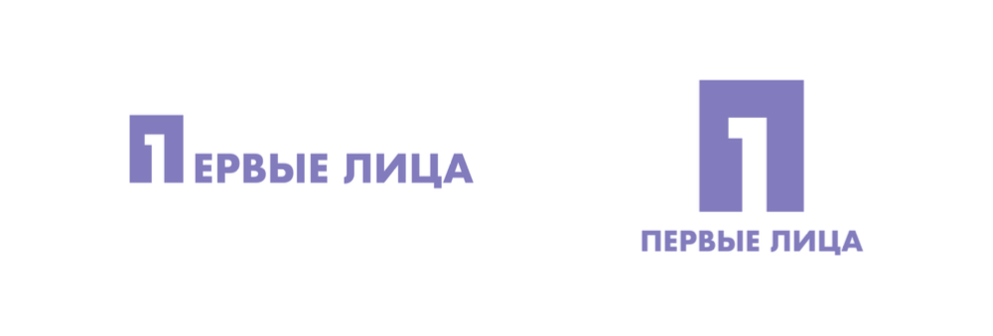
Option 2. Focus on the “First”
A more universal logo, does not give an association with space directly. The interweaving of the unit into the letter “P” gives the viewer, first of all, a focus on the importance of clients for the company. In this version, we represent space in the letter “P” and the most important person, the client, in this space.
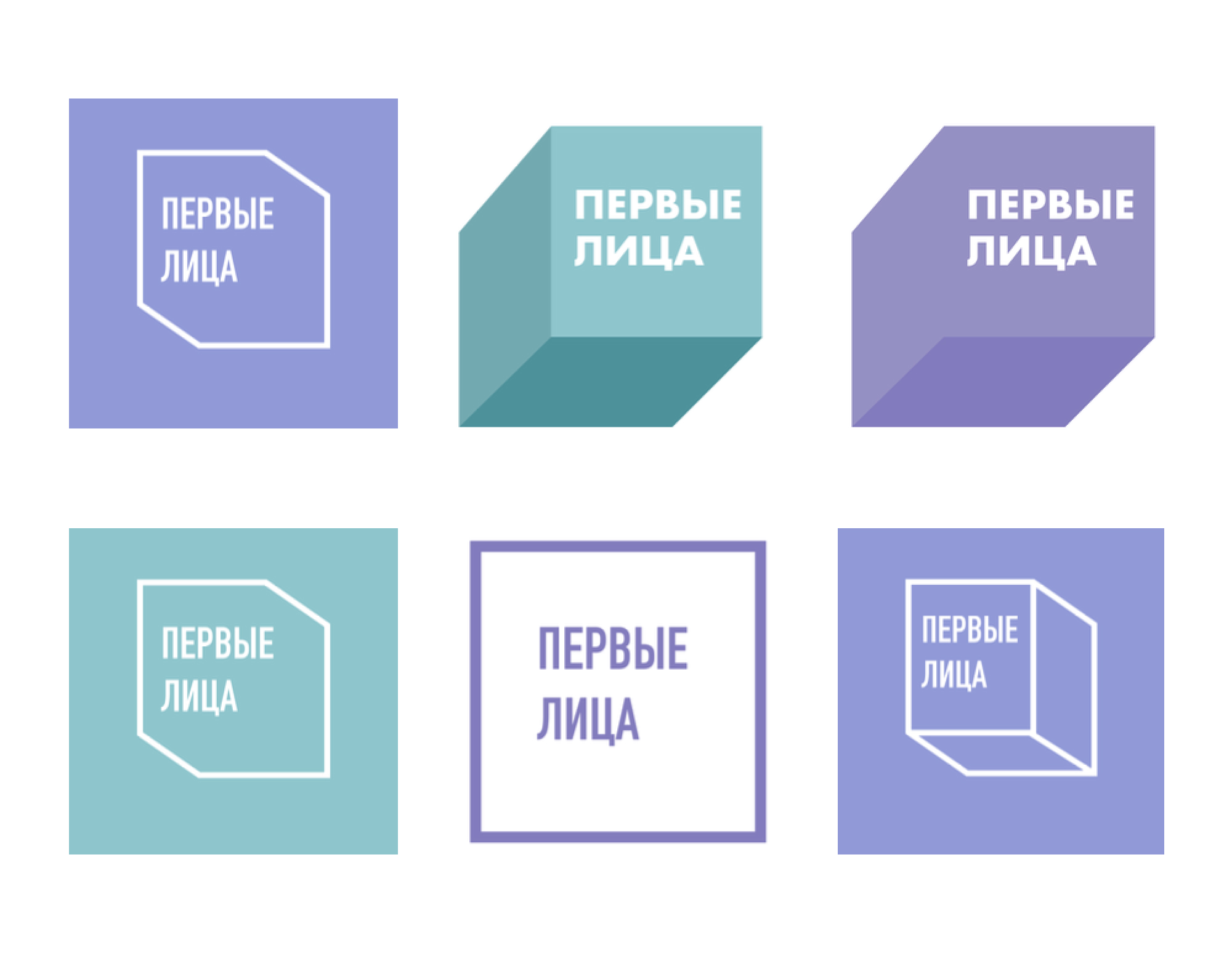
Option 3. Interweaving of space and man
Graphic elements and text composition. Geometric figures in the logo are identified with space and man, respectively.

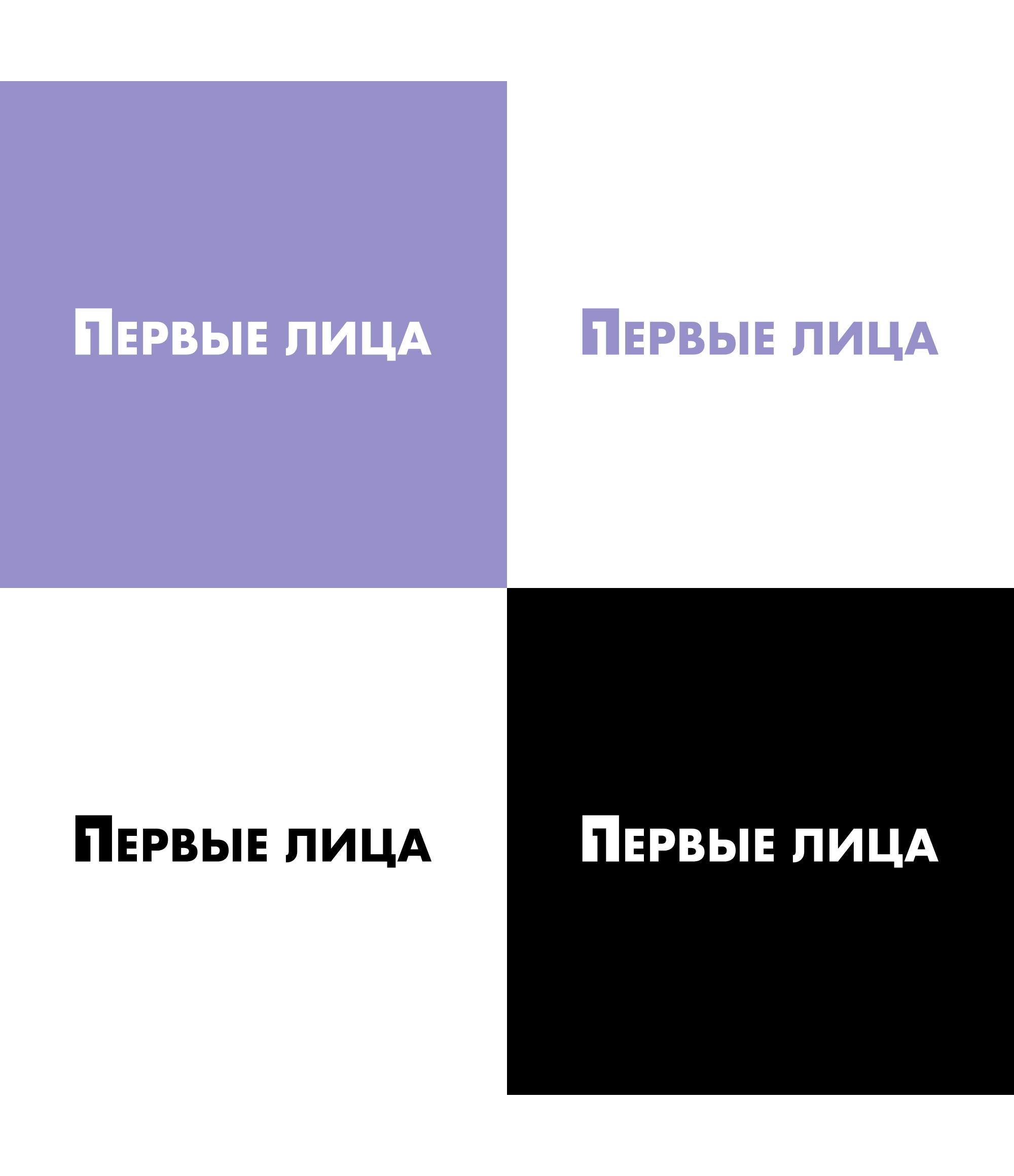
The final version.
The client was most inspired by logo #2 and chose it. An excellent result is what we do our job for 💪🏼